COMM 130 Project 1 Flier
Description:
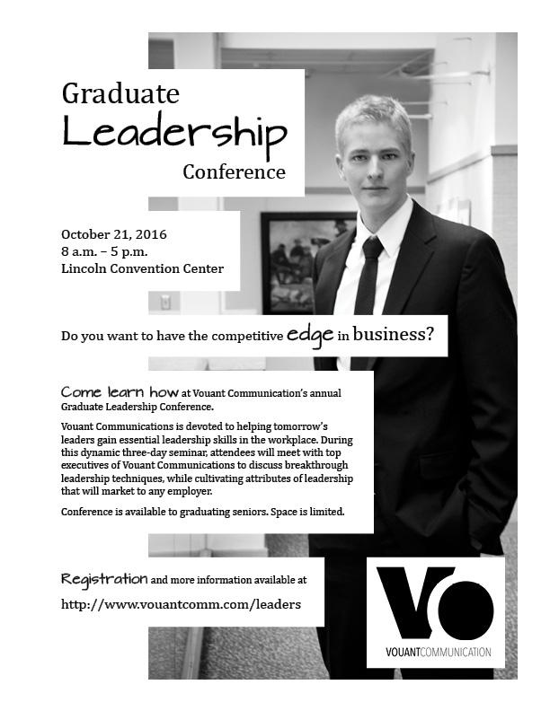
Grayscale flier to promote a leadership conference for graduates and graduating seniors.
Process:
My instructor provided the text, image, and logo for this project. I designed the layout.
I started by making four different sketches, then I selected one as my model for creating this layout in Adobe InDesign. I created repetition and rhythm using the horizontal, white rectangles, varying their spacing according to the relatedness of their content. I guided my placement of the content by the order I would care about it if I were, say, skimming a bulletin board in a campus building. Since I wanted to avoid the stereotypical slick, sterile corporate spaceship look, I used a handwritten font to convey a little casualness.
I originally colored the horizontal rectangles a dark gray with white text, but feedback from critiques indicated that was a bad choice, so the rectangles became white. That change made a huge difference in the layout.
Message:
This conference will give you leadership skills and make you more capable and awesome in the workplace.
Audience:
College students and graduates ages 22-29.
Top Thing Learned:
Value has a huge effect on the impact of a composition.
Title Font Name & Category:
Architect’s Daughter—Hybrid (sans serif script, perhaps decorative also)
Copy Font Name & Category:
Cambria—Oldstyle serif
Links to images used in this project:
Vouant Logo 2
Standing Man
Video: