COMM 130 Project 2 Event Ad
Description:
Color ad to promote a fictional fundraiser of my own choosing.
Process:
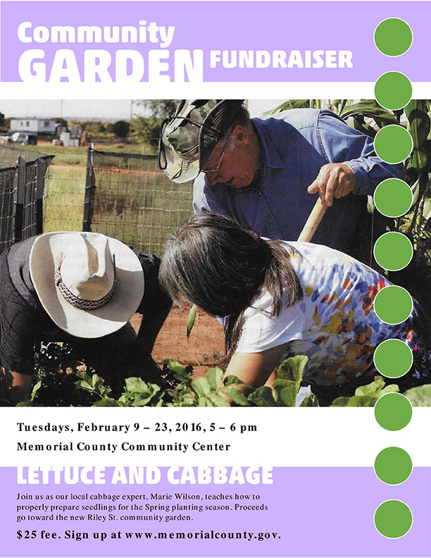
The challenge of this project was to design it using only Microsoft Word, and the only images permitted were scanned ones.
The scanned image had greens, oranges, and blues, so I decided to add purple to the ad to make a big split complementary color scheme. I think using the lighter tint of purple softened the composition, and a louder color would have been less appropriate for the content and audience. By flipping the original image horizontally, I was able to make the gaze of the people in the image flow into the text below. I struggled a little to find a source of pattern, but eventually created one by adding the green circles on the right. All the text was originally black, but critiques indicated that that made the titles touching the edges of the purple blocks look awkward. Rather than move the text off the edge, I changed the titles to white, creating a cutout look, which was one solution developed in a critique session. I also changed the font to a heavier one to compensate for the change in legibility. I experimented with dropping an inner shadow from the text, but that was too much, so I removed the shadow.
Message:
Gardening classes will be relaxing and make you a more capable person.
Audience:
Local adults and seniors.
Color scheme and color names:
Big split complementary—orange, green, blue, purple
Top Thing Learned:
Adding elements for pattern can greatly improve the appearance of a composition, even if the elements aren’t necessary for its structure.
Title Font Name & Category:
Akko Rounded Std Medium—Sans serif
Copy Font Name & Category:
Georgia—Oldstyle serif
Scanned images used, sources, original sizes, location of scanner used:
Image of gardeners, from the Ensign magazine, March 2011, p. 60. Original dimensions about 7.25″ wide by 8.5″ high. Scanned in home scanner.
Video: