COMM 130 Project 3 Photodesign
Description:
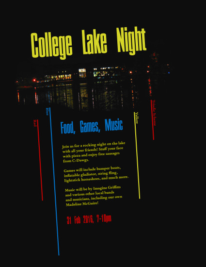
A photodesign project to demonstrate good photography and image editing skills, as well as the ability to pull a color scheme from a photo and use it in a poster.
This composition was one of the top two in my class for this assignment, and was therefore listed on the Visual Focus sample photodesign page under Winter 2016.
Process:
This piece started with the photo. I edited it using the levels, vibrance, and selective color filters, as well as the sharpen tool. This really made the different colors latent in the photo stand out and it created an image with a lot of impact.
Once that was in place, the photo took over and the design created itself. The reflected lines in the water demanded to be extended, and the resulting lines provided a rhythm. My planned monochromatic color scheme turned into a triadic one. The composition rotated to align with the photo and produce excitement. Everything just seemed to fall into place.
But not absolutely everything fell into place. The original copy font was difficult to read due to color and weight, and the bright colors were harsh on the pure black background. I solved these issues by choosing a heavier copy font, lightening the black background slightly, and darkening the bright colors a bit. I also found the date and time worked better in the title font than the copy font.
Message:
This event will be fun and exciting.
Audience:
Students at a college.
Top Thing Learned:
Design elements can be pulled from photos, in addition to colors.
Color scheme and color names:
Triadic—red, yellow, blue
Title Font Name & Category:
Corporate—Sans serif
Copy Font Name & Category:
Bembo Book MT Pro Bold—Oldstyle serif
Thumbnail of original, unedited image inserted:

Date and location you took the photo(s):
2 Feb 2016, Tyler Haynes Commons at the University of Richmond.
Video: