COMM 130 Project 4 Montage
Description:
A montage using a quote from a song to encourage missionaries to open their mouths and preach the gospel.
Process:
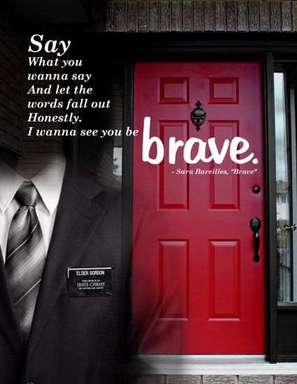
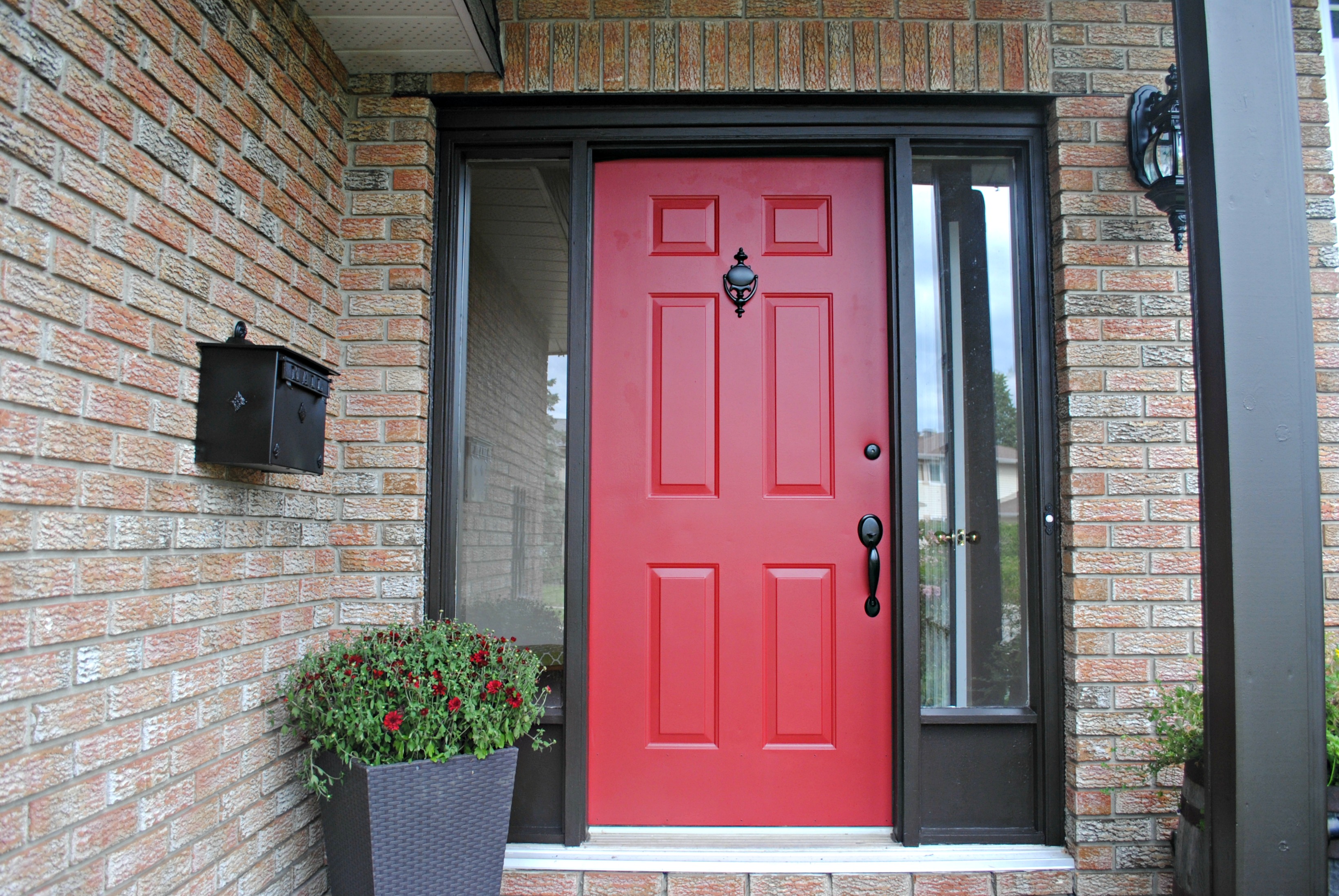
Hunting for photos was a challenge in this project. I wanted to convey the idea of an LDS missionary working up courage to approach a door while tracting, so I wanted a door that loomed and looked intimidating. But that was hard to find short of ones that looked like doors from a castle or haunted house, and I needed a residential door. I eventually decided on this one, where the photo was taken at a slight upward angle and the red color imparted a small feeling of alarm. The missionary image I used in my first draft was too small to use very easily, so I switched to the one currently shown.
I was torn on whether to use the font pictured for the word “brave”, Martina Regular, or to use Hollywood Hills Regular instead. Martina conveyed boldness, confidence, and freedom. But I liked Hollywood Hills because it was also bold, it was more legible, and the shakiness of the baseline suggested a bit of nervousness, like someone had tried to gather their nerve, but only mostly succeeded. I resolved the issue with a spur-of-the moment critique from a friend.
Message:
Encouragement to share the gospel of Christ without fear and work up the courage to knock on one more door, despite verbal abuse you may occasionally receive.
Audience:
Primarily missionaries from the Church of Jesus Christ of Latter-day Saints, but the message is also applicable less directly to members of the church in general.
Top Thing Learned:
Working with preexisting images can be constraining because you cannot always control them in the way you need or find the ones you want. Therefore sketching may be less useful, unless you’ve found the images first. Opportunism has a place in finding images and making design changes.
Filter/Colorization used and where it was applied:
I applied various filters to the door image to make the red of the door stand out and subdue the blues and greens in the image. I also placed two layers over that image to darken and desaturate the brick so it would not compete with the door.
I also lowered the saturation of the missionary, especially the flesh tone, which I did not want to compete with the door.
Color scheme and color names:
Monochromatic—red
Title Font Name & Category:
Martina Regular—Script
Copy Font Name & Category:
Century Schoolbook Bold Italic—Oldstyle serif
Thumbnails of Images used:

Sources:
Door photo
Door photo on tixeertne.wordpress.com
Missionary photo
Missionary photo on www.ldsdaily.com
Lyrics for “Brave” by Sara Bareilles
Video for “Brave” by Sara Bareilles
This project was for educational purposes.
Video: