COMM 130 Project 8 Brochure
Trifold Brochure
Outside:
Inside:
Description:
In this project, we created a brochure. Mine is a trifold.
Process:
In Adobe Photoshop, I used a layer mask to cut out the eight-pointed tile pattern, as well as perform color alterations on one of the photos. I used Illustrator to make the LaPrecia Tile logo. I assembled the layout in InDesign, making use of alignment and groups to more conveniently manipulate the arrangements of square elements, which echo the logo.
Critique was important for this project. Critiquers were able to point out issues with principles such as flow, alignment, and repetition, and they also recommended changes. As a result, I drove the repeating squares motif home more and rearranged many elements.
Message:
This company produces work that is luxuriant and affordable.
Audience:
Middle-class families that want upper-class tile work.
Top Thing Learned:
Images need special arrangement or treatment to look professional.
Color Scheme and Color Names:
Monochromatic—brown
Title Font Name & Category:
MoolBoran Regular—Sans Serif
Copy Font Name & Category:
Kokila Regular—Serif
Word Count of Copy:
310+ words
Thumbnails of Images used:

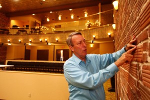
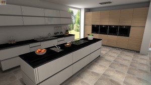
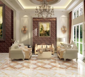
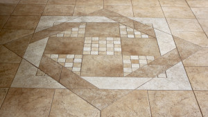
Image Sources:
Sink
Man in theater
Kitchen
Map
Tiled parlor
Tile floor pattern
This project was for educational purposes.