COMM 130 Project 6 Stationery
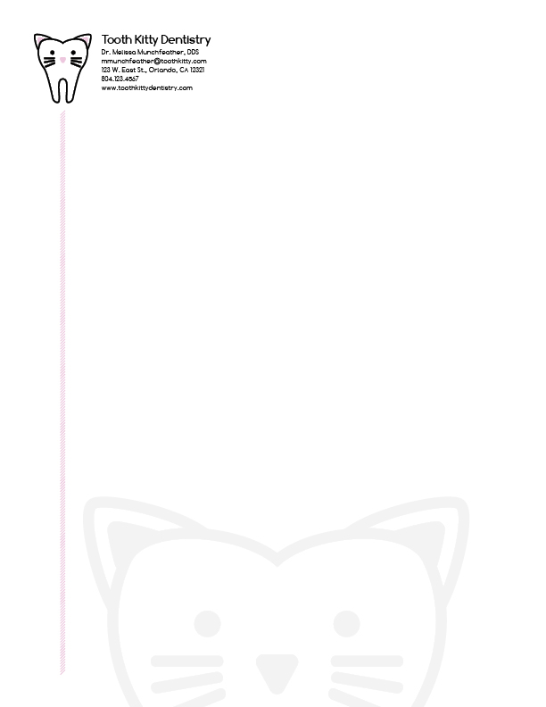
Stationery:

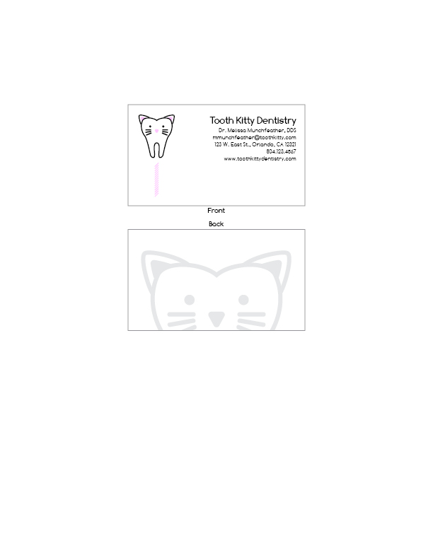
Business Card (8.5″ x 11″ layout):

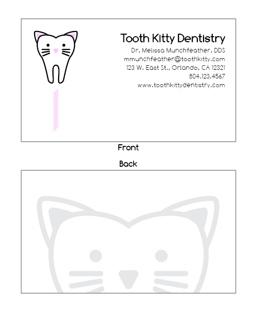
Business Card (enlarged layout):

Description:
Matching stationery and business card with a custom logo.
Process (Programs, Tools, Skills):
I created the logo in Adobe Illustrator, making extensive use of the reflect tool. The inside of the ears is a path offset from the edges of the ears, with the point rounded. My inspiration was a cartoon tooth on the side of a local dentist’s office. It had nothing to do with cats, but I was sitting next to my wife at the time, who is a fan of cats and pink. Thus my logo became reminiscent of Hello Kitty.
The remainder of the layout was a product of Adobe InDesign. For the watermark, I made a copy of the logo and colored it gray in Illustrator. Then I set it to 50% opacity once I had it in InDesign. I experimented with the type extensively to get it correct, and I think I ended up something as fun and light as the logo.
Message:
This dentist’s office is fun and cute.
Audience:
Anyone, but there would be especial appeal to women or those with daughters.
Top Thing Learned:
This activity boosted my confidence in my ability to make logos and draw free-hand in illustrator. I also found that an extremely simple design worked extremely well, so I feel that was a learning experience.
Color Scheme and Color Names:
Monochromatic—pink
Title Font Name & Category:
Comfortaa Bold—Sans Serif
Copy Font Name & Category:
Comfortaa Light—Sans Serif
Video: