COMM 130 Project 7 Web Page

Description:
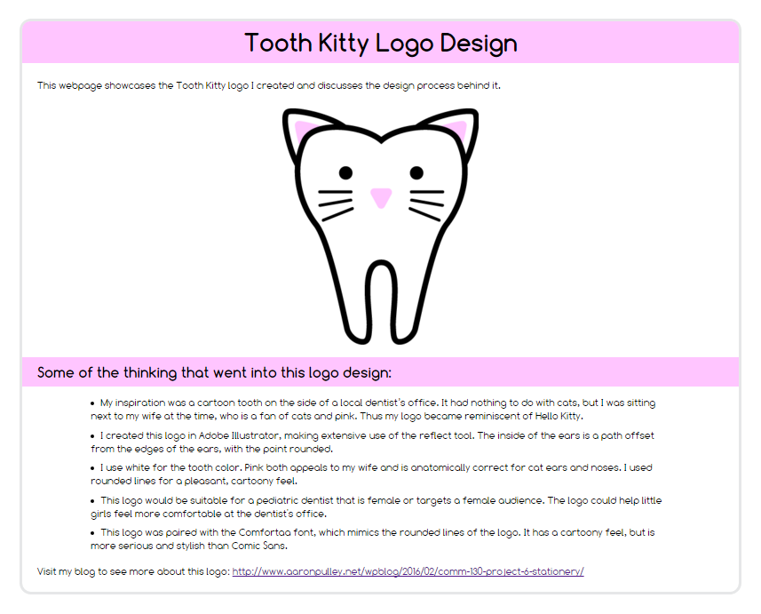
A web paged based on a previously designed logo. This was a beginning exercise in HTML and CSS.
Process:
Since this was a beginning exercise, we started with sample text that included doctype and meta charset tags. We enclosed the remaining text in appropriate tags. Then we linked the page to a template CSS file and customized the stylesheet to match our own chosen color scheme and styling.
I chose to use my Tooth Kitty logo from the last project. I accordingly set up a black, gray, white, and pink color scheme, using adobe Illustrator’s color picker to find hex values for the gray and pink. I was able to go to Google Fonts, find the same font I used on the last project, and incorporate it. I also optimized line spacing for readability and tweaked spacing between text elements in a couple of places for better use of proximity. And I included some elements of responsiveness.
In consequence of feedback from critiques, I also moved a little text above the logo and gave the second heading a pink background like the first.
Message:
The web page describes my process for creating the logo and should communicate my level of competence.
Audience:
Web viewers who may draw inspiration from my work or consider me for employment.
Top Thing Learned:
Heading backgrounds can be used in aesthetically pleasing ways.
Color scheme and color hex(s):
Monochromatic—pink (#FFC5FF), black (#000000), gray (#E6E7E8), white (#FFFFFF).
Title Font Families & Category:
Comfortaa 700—Sans Serif
Copy Font Families & Category:
Comfortaa 300—Sans Serif
Changes made to the CSS:
- Added a Google font
- Set default font for site (Comfortaa 300)
- Changed background color
- Changed body border
- Made body width responsive
- Changed heading fonts (Comfortaa 700), margins, and background colors
- Changed font size, font color, and line spacing for paragraph and list copy
- Changed image display settings, including adding responsiveness
- Narrowed list width in a responsive way
Word Count:
212